Have you tried applying some of the scrapbooking-coloring mash up tips we shared previously? Well, talented colorist Robin Petersen Wilson‘s back. Here are some practical coloring tips she shared with us that can help make your coloring look more polished.
Four Tips To Make Your Coloring Go From Fair to Fabulous!
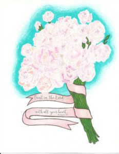
1. Think outside of the box – Or lines in this case. Have you ever tried coloring on the black print/line art itself? Silver or white gel pens work well for this. You can come up with some pretty sophisticated look like these pages from The BIG Christmas Coloring Book and Blessings in Bloom Gratitude Coloring Journal.


2. Line work – Speaking of line work, when coloring, your black lines will fade or get covered by your medium.
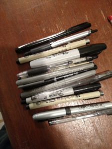
Robin always goes back over her lines with a black medium (pen, colored pencil or marker) to make them stand out again. She has a collection of black media that she uses just for this.
Going over the line work gives the picture more detail and looks more finished. The sample pages below from The BIG Christmas Coloring Book shows that the devil’s in the details.

Robin uses several media depending on the width of the line. On the sample page, the really wide ones are colored pencil, going down to a .05 pen.
You don’t want to change the drawing, just enhance what has faded from your coloring.

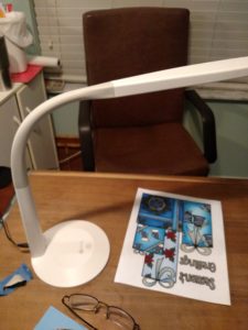
3. Lighting – You may think you have great lighting for your coloring projects until you invest in a day light lamp.
Robin says it will literally make a night and day difference in your coloring. They are not cheap so don’t forget to use you coupon. Michaels has a 50% off one that expires today. Amazon has a few as well. Robin has Ottlite.

4. Reading Glasses – Who would have thought that this would be included in your coloring tools list? If you’re over 40 years old, chances are your near focus isn’t as good as it used to be.
Robin advises going to the Dollar store and picking up a pair or five (they are only one dollar ?) of the 2.75 or 3.0 reading glasses.
These will help when you are blending, doing small spaces or making sure you have complete coverage on your coloring.
She said that you will see that your blending is smoother and you stay in the lines better. This also makes working on your line work go much faster.

We hope these four tips elevate your coloring from fair to fabulous ?.
Let us know what you think. And if you try any of these, we would love to see your colored pages. Tag Maria Castro or add #scribocreative #colormymoods.
Maria Castro of ScriboCreative.com is a participant in the Amazon Services LLC Associates Program, an affiliate advertising program designed to provide a means for sites to earn advertising fees by advertising and linking to Amazon.com.


I love these tips! And I agree, going back over the line art perks up the original image, which can do wondrous things. However, while I don’t ever “change” the original image, I am oft guilty of thickening the original line art (but only to make a focal point) in places- like the “seasons greetings” script on the example page (I love the before and after shots! The gradation in the middle of the gifts is lovely!).
My only thing to add is that it isn’t just folks over 40 that might need reading glasses, lol. And if you’ve never worn glasses before, starting with a 2.75 or 3.0 might cause a *major* headache, so when you go to the dollar store, maybe pick up whatever feels comfortable to read a label on something there, as well as several steps “up.” That way, you can progressively use stronger and stronger ones, with time to adjust to them slowly. Your brain-and coloring, of course!- will appreciate the efforts. It’s just too bad that when you buy the glasses that a cutie like Raggs isn’t included!
Again, great tips and thank you for another great post!
I’m glad you liked it Tonya and thanks for sharing your own tips. 🙂